Millennia
Capital, Given Greater Dimension.
Millennia Capital Partners is a private investment firm specializing in securities-backed financing and asset-based lending, working with investors, institutions, and private clients across global markets.
The existing identity provided the starting point.
Our task was to make it work harder.
OWDT expanded Millennia’s visual assets into a broader digital language, creating a website that could communicate financial sophistication without becoming visually predictable.
The result is a system built around structure, movement, depth, and control.
Services Utilized
Website Strategy
Information Architecture
Responsive Design
Visual System Expansion
Digital Art Direction
Typography System
Image Direction
Interaction Design
Front-End Experience
WordPress Development
Client Goals
elevate Digital Presence
expand Visual Language
clarify Complex Services
strengthen Market Credibility
improve User Navigation
differentiate From Competitors
highlight Global Expertise
increase Service Discoverability
support Business Development
create Scalable Structure
improve Mobile Experience
modernize Brand Expression
A Financial Identity Beyond Convention
Financial services often rely on a familiar visual shorthand: dark colors, static photography, dense information, restrained movement.
For Millennia, we wanted authority without repetition.
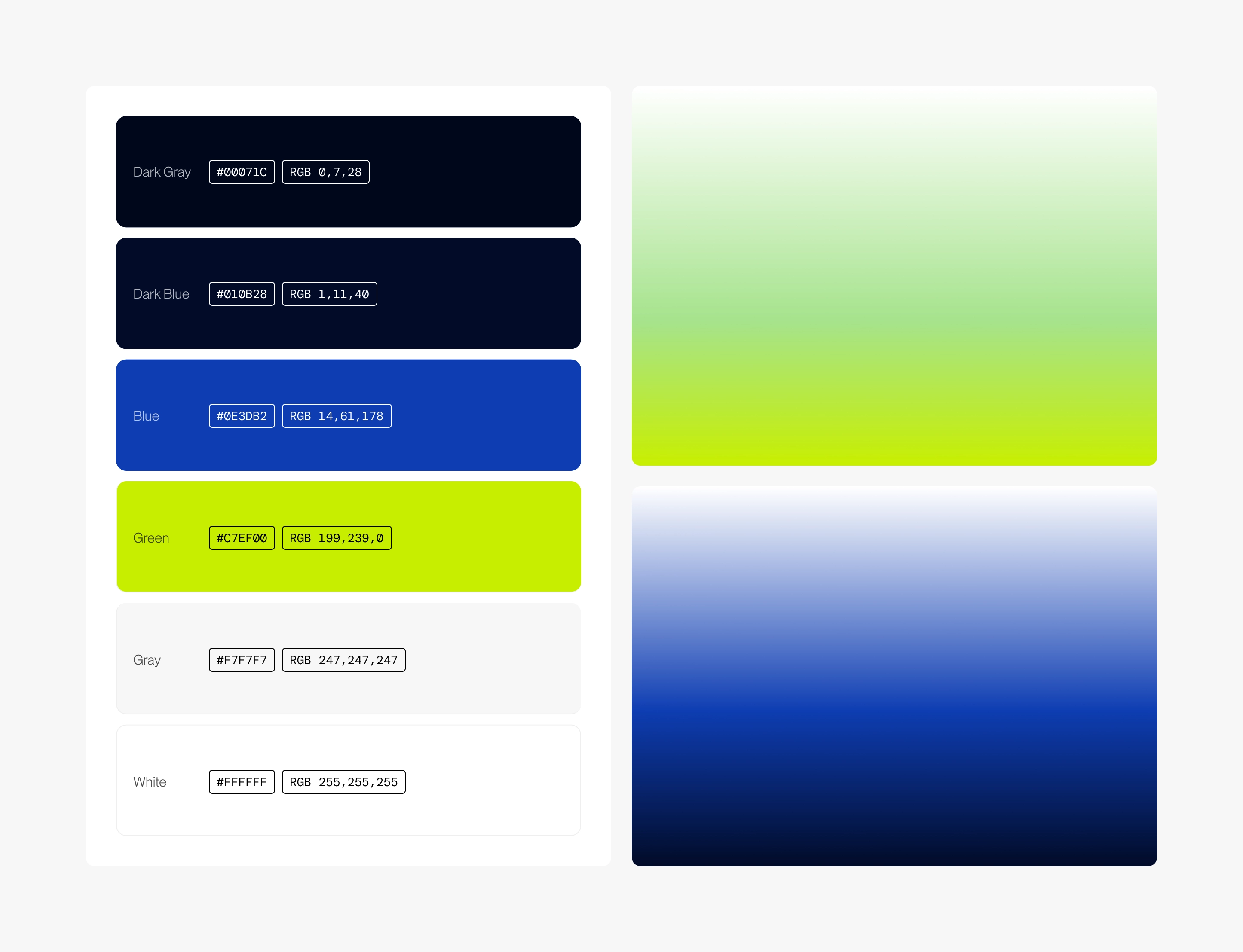
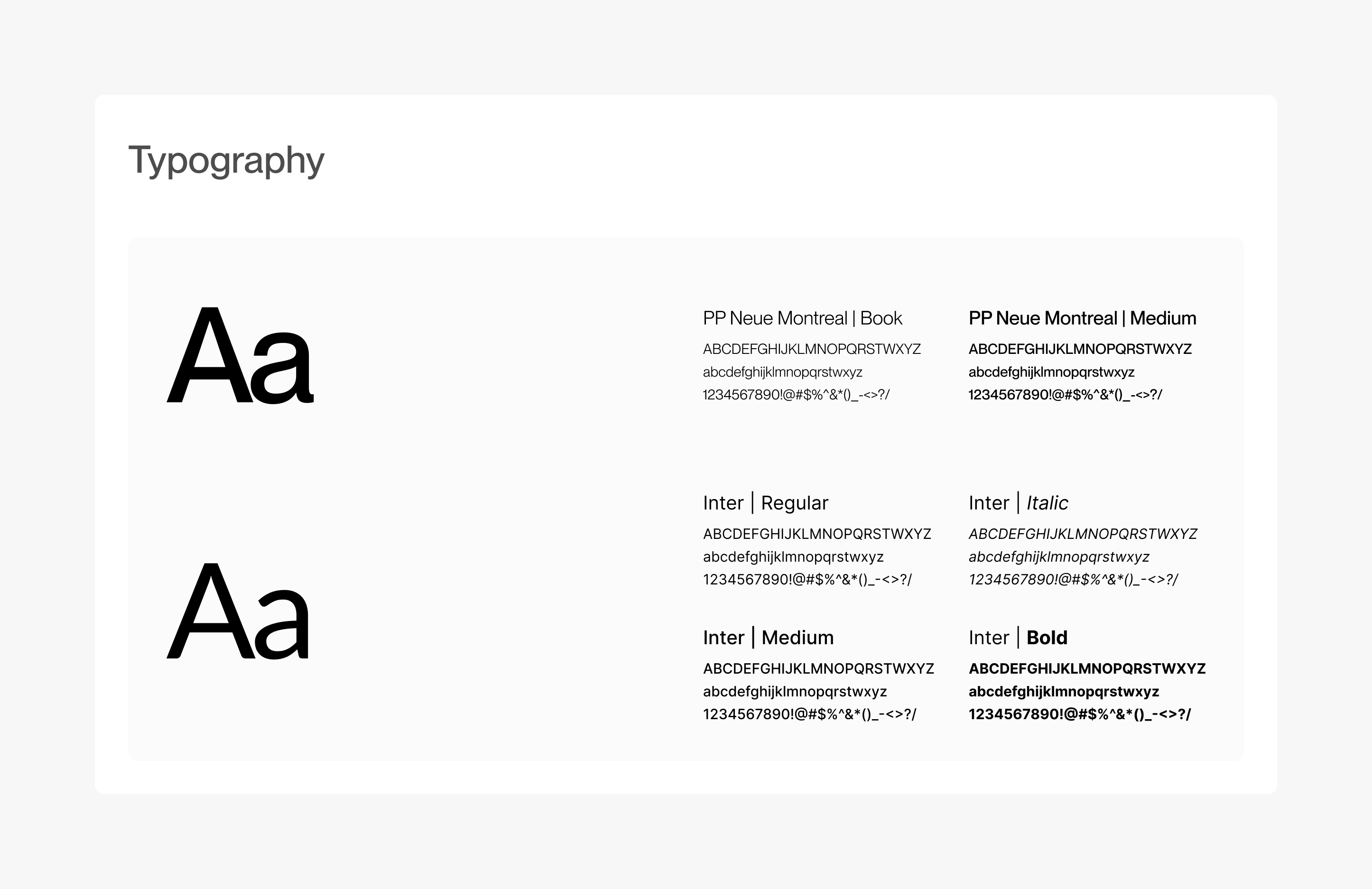
We extended the existing identity through a more expressive combination of typography, color, image treatment, spatial composition, and motion.
The system remains disciplined, but it is no longer static.
It gives Millennia a more contemporary presence while preserving the confidence expected of a firm operating in complex capital markets.
Liquidity As a Visual Idea
Millennia’s work is fundamentally about movement.
The movement of capital.
The release of liquidity.
The relationship between assets and opportunity.
That idea became part of the visual language.
Forms stretch, flow, overlap, and shift across the interface. Photography is treated with depth and tension rather than simply placed inside containers. The website feels active without becoming restless.
The visual system translates an abstract financial concept into something tangible: capital in motion.

Depth Instead of Decoration
The extended visual language uses layering as a functional device.
Transparent surfaces, gradients, architectural forms, and overlapping elements create a sense of dimensionality throughout the experience.
This depth is not ornamental.
It reflects the nature of Millennia’s work, where financing rarely exists as a single transaction. Every structure involves multiple variables: asset value, timing, liquidity requirements, risk, jurisdiction, and long-term strategy.
The interface mirrors that complexity while keeping the experience visually controlled.
Making Complex Finance Easier to Enter
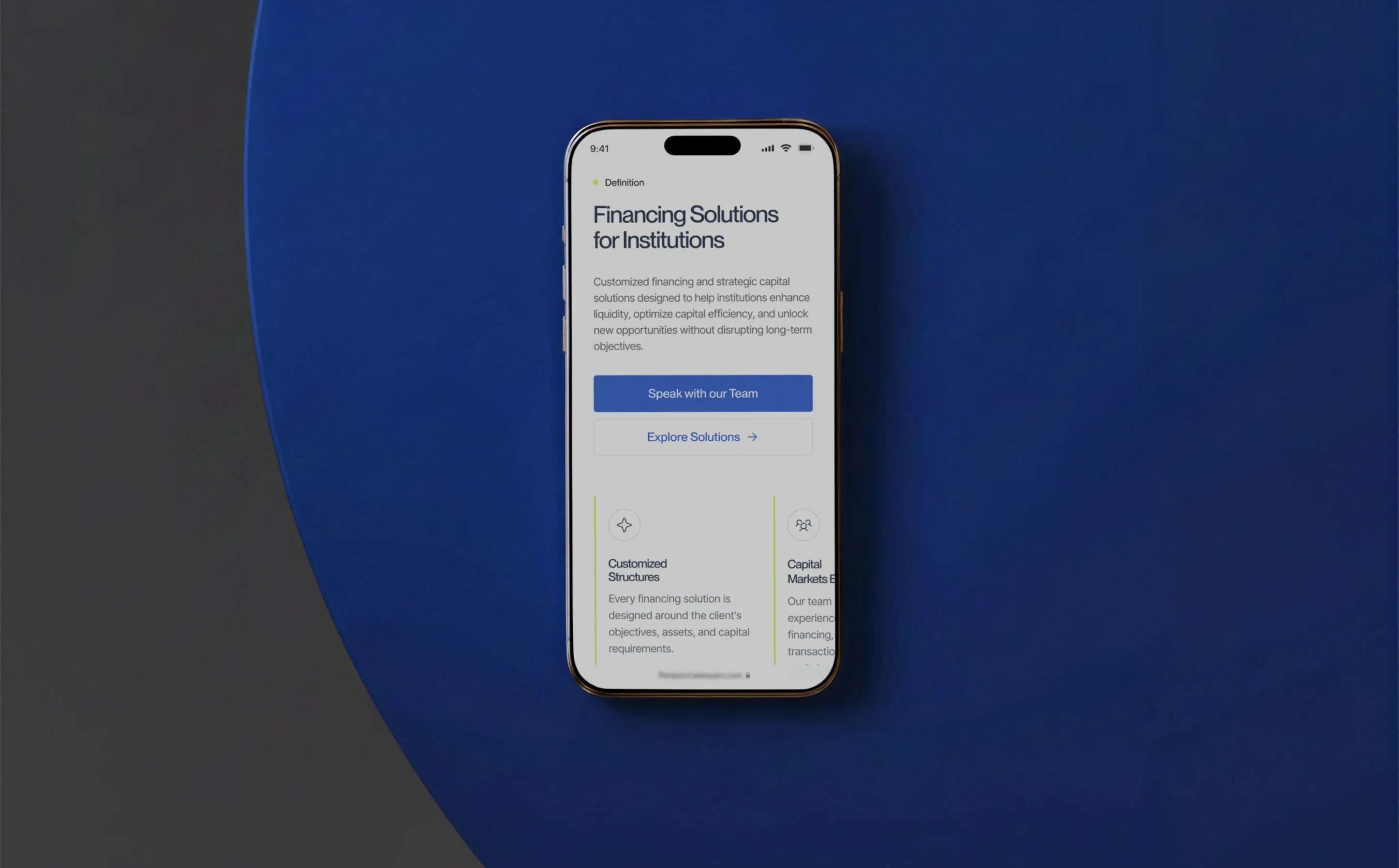
Millennia offers financing solutions built around individual portfolios, objectives, preferred structures, and timelines.
That complexity created a clear design challenge.
The website needed to feel sophisticated without becoming difficult to navigate.
We used scale, hierarchy, spacing, and strong sectional transitions to break information into manageable decisions.
Instead of confronting visitors with everything at once, the experience gradually reveals the firm’s capabilities.
Complexity remains present.
The friction does not.
A System Built Around Contrast
The website moves deliberately between dark and light environments.
Deep tones create authority and concentration. Brighter fields create openness, transition, and emphasis.
That contrast gives the experience rhythm.
Some moments are immersive and atmospheric. Others are spare and highly informational. Together, they create a digital system capable of supporting both the emotional and analytical sides of financial decision-making.
The result feels serious without feeling severe.
Expertise Made Visible
Millennia’s credibility comes from more than its financing products.
It comes from experience, reach, and execution.
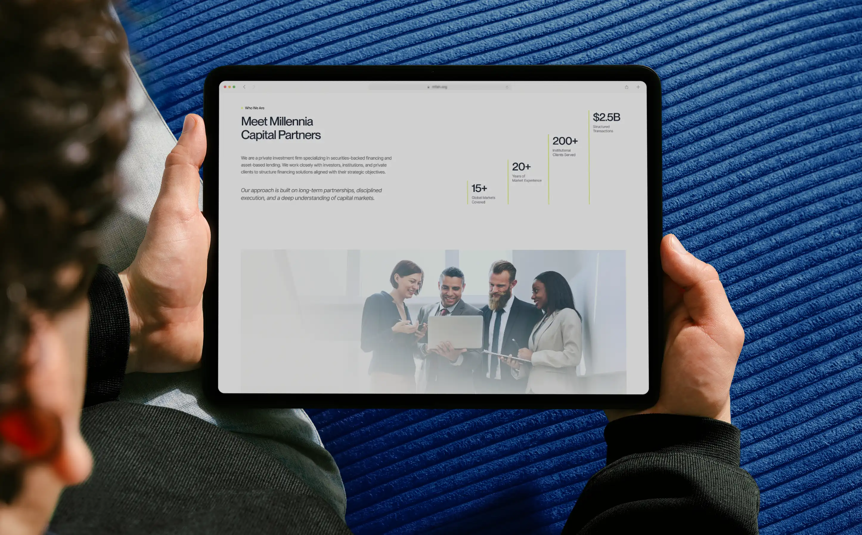
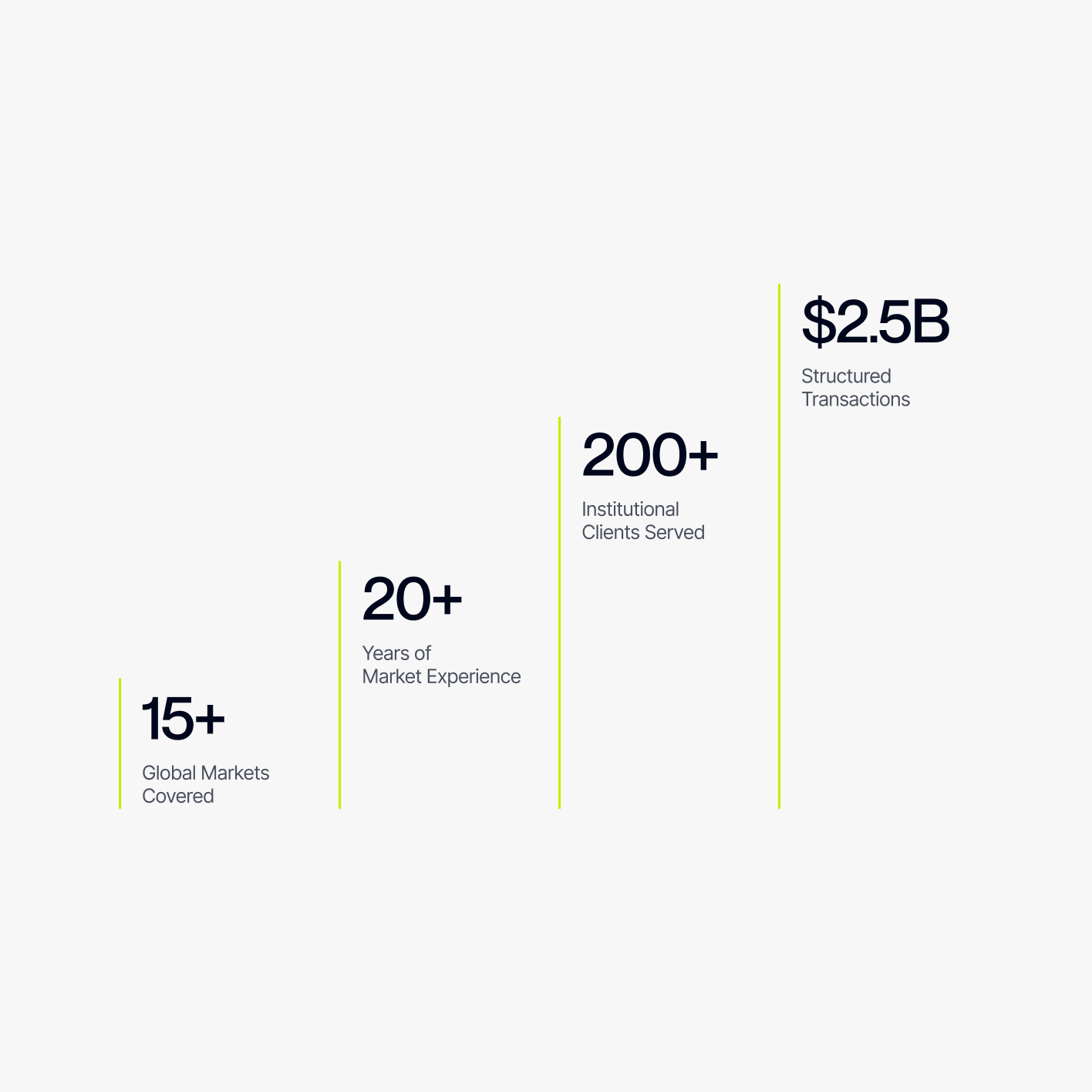
The firm describes more than 20 years of market experience, coverage across 15+ global markets, 200+ institutional clients served, and $2.5 billion in structured transactions.
We treated these numbers as part of the narrative rather than secondary information.
Scale, whitespace, and typographic emphasis allow performance indicators to carry visual weight.
Data becomes evidence.
And evidence becomes part of the brand experience.
Solutions Organized Around the Client
The site architecture was designed around the way clients actually approach financing.
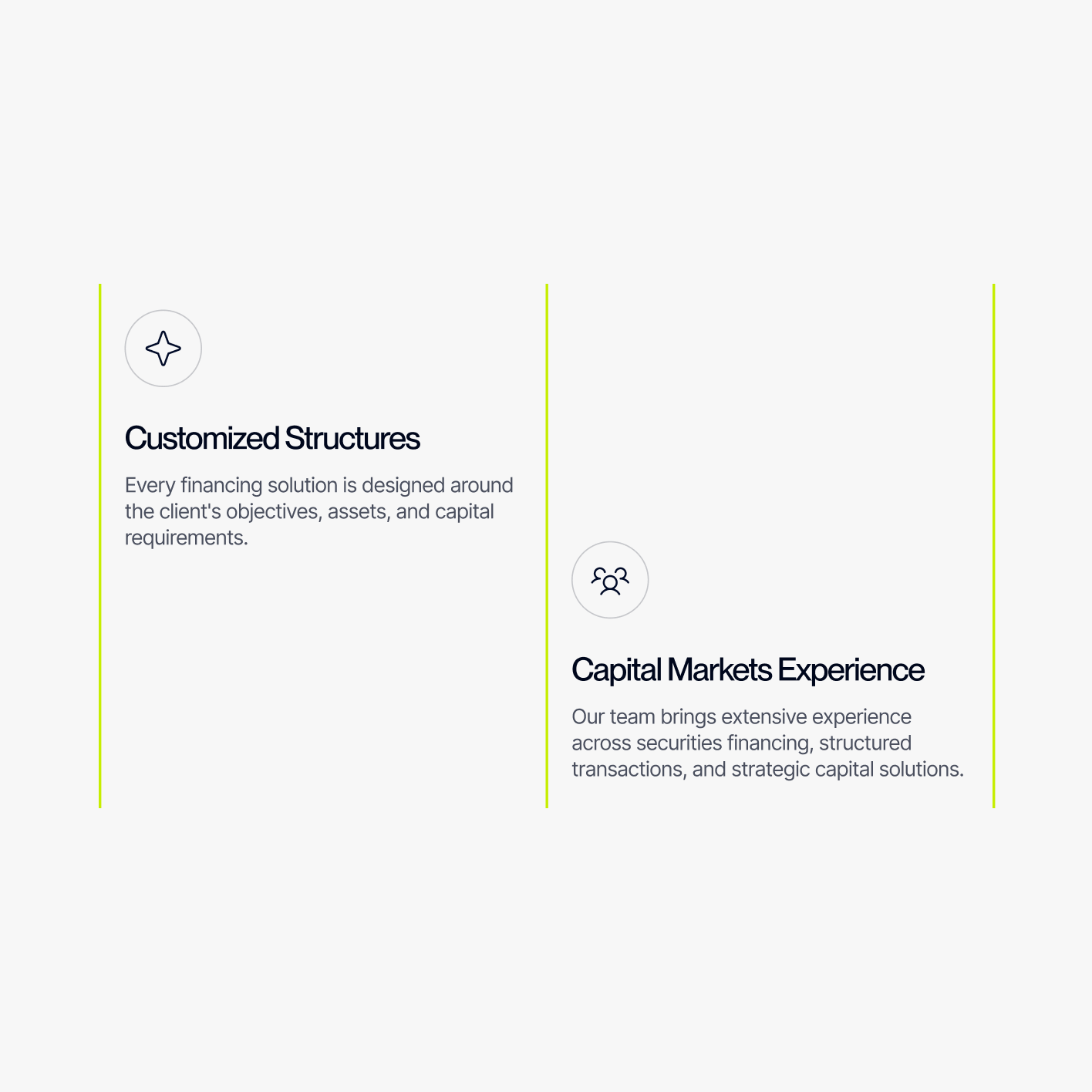
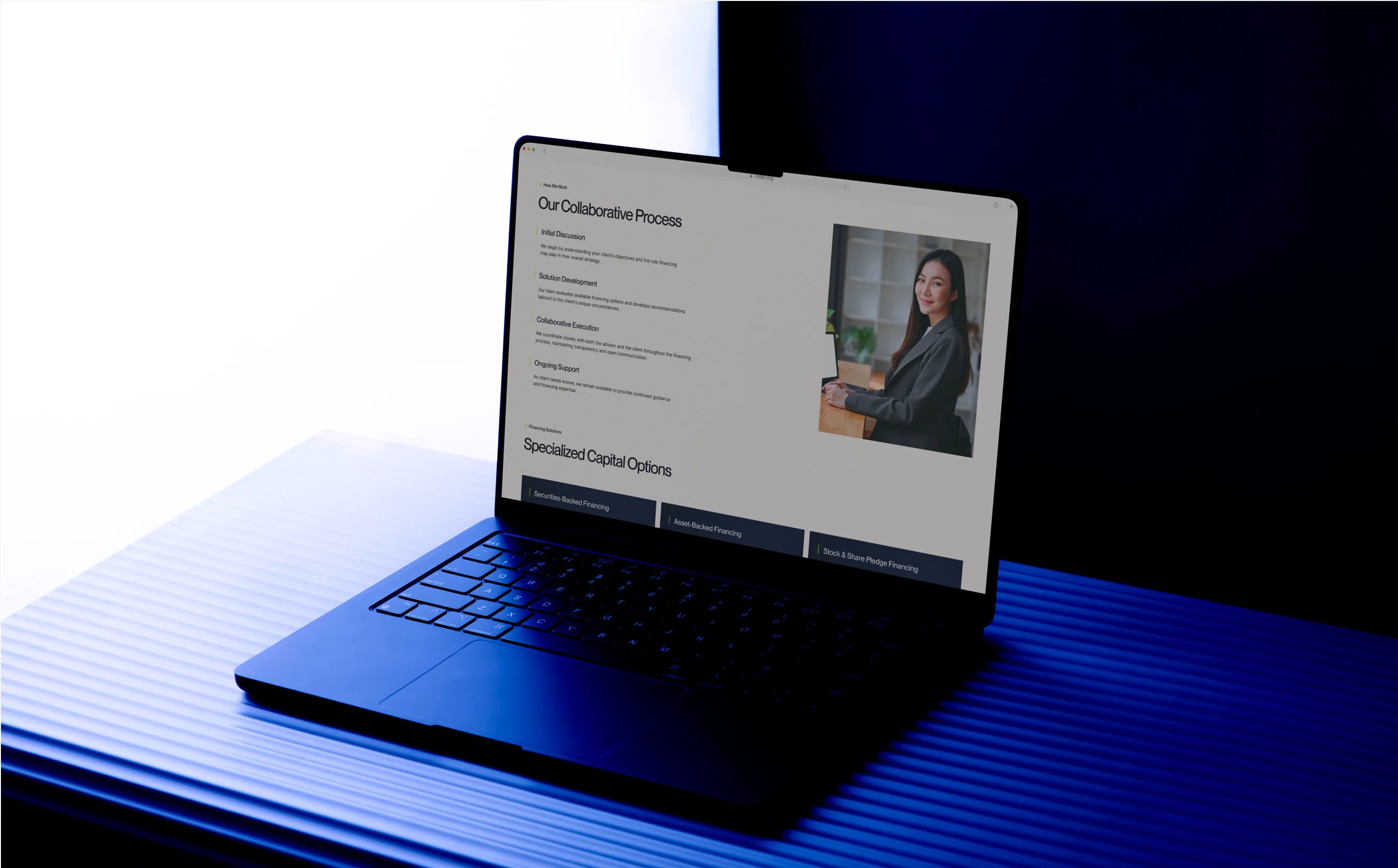
Institutions, investment managers, independent advisors, and individual borrowers arrive with different objectives, while Millennia’s solutions span securities-backed, asset-backed, equities lending, and share pledge financing.
The experience creates clear paths between audience and solution.
This allows the website to accommodate complexity without making the organization itself feel complex.
The structure does not ask visitors to understand Millennia first.
It helps Millennia understand where the visitor needs to go.
A More Expansive Digital Expression
The final website gives Millennia’s existing identity significantly more range.
The mark remains intact.
Around it, we built a larger system of motion, color, typography, imagery, interface behaviors, and spatial relationships capable of supporting a global investment firm across multiple audiences and financing solutions.
The result is not a new brand.
It is a more complete expression of the one already there.
Structured, but fluid.
Sophisticated, but accessible.
Financial, without becoming conventional.
Global, without losing precision.
A digital experience designed around the same principle as Millennia’s work itself: Capital, structured around opportunity.
Explore More from OWDT
Each project we undertake is a study in precision — where design, technology, and storytelling converge. Discover more of our work and see how we help institutions, brands, and innovators shape digital experiences that endure.
Have Us Contact You

CLOSE PANEL
Thank You.
Your information has been transmitted successfully and securely.
CLOSE PANEL