
Featherwood
Making the Market Feel Closer
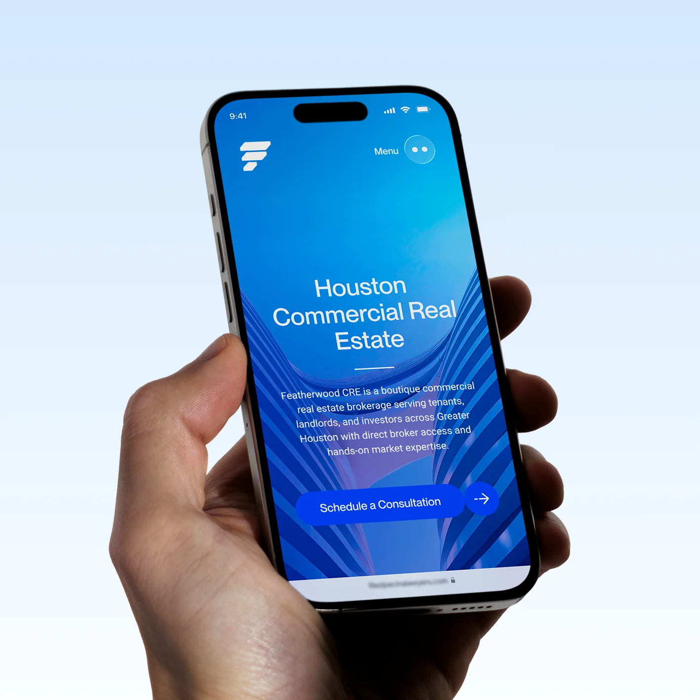
Featherwood CRE is a boutique commercial real estate brokerage serving tenants, landlords, and investors through direct broker access, hands-on market knowledge, and senior-level involvement.
The firm already had an identity. Our task was not to reinvent it.
It was to give it more room to operate.
OWDT expanded Featherwood’s existing visual language into a digital system capable of expressing the sophistication of its work, the immediacy of its relationships, and the scale of the market it navigates every day.
The result is a website that feels less like a conventional brokerage and more like the firm itself: informed, direct, composed, and close to the action.
Services Utilized
Front-End Experience
Visual System Expansion
Art Direction
Digital Typography
Responsive Design
Client Goals
emphasize Direct Broker Access
showcase Hands-On Expertise
support Tenant Representation
strengthen Landlord Positioning
clarify Investor Services
elevate Boutique Positioning
humanize Broker Relationships
express Market Intelligence
modernize Digital Experience
differentiate From Large Brokerages
improve Service Pathways
increase Client Confidence
An Identity, Extended
The strongest identities are not static assets. They are systems capable of changing scale.
Working from Featherwood’s existing brand foundation, we developed a broader visual vocabulary for digital use: typography, color relationships, image treatments, hierarchy, composition, interaction, and content behavior.
Nothing was added for decoration.
Every decision was made to help the identity perform more effectively across a complex commercial real estate experience.
The visual system became more dimensional.
The typography became more expressive.
The palette gained greater range.
And the website became a place where the existing brand could move.
A Clearer Voice
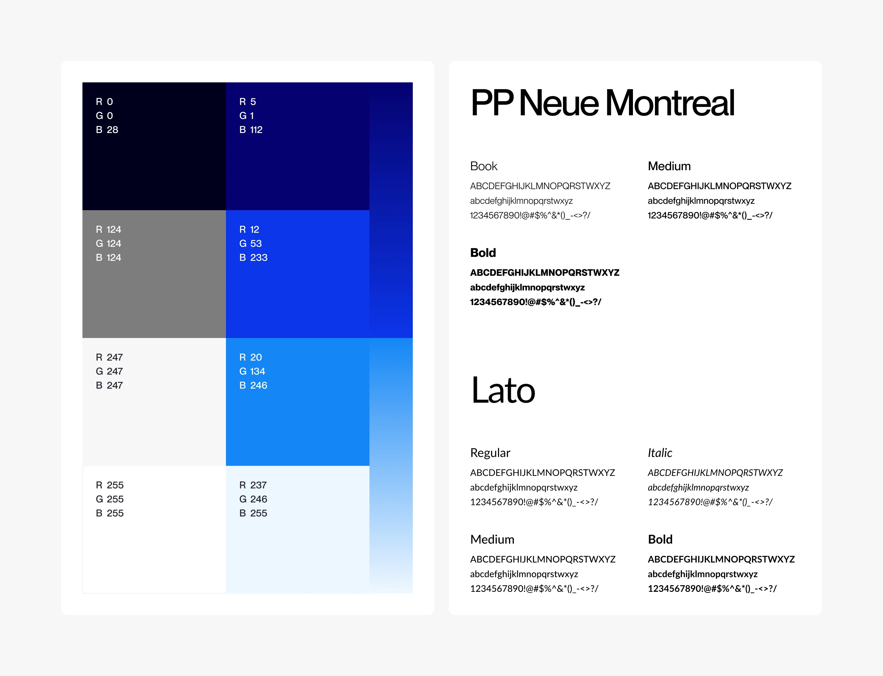
The typography was developed as a system of contrast.
PP Neue Montreal brings precision and character to headlines, statements, and moments of emphasis. Its direct, contemporary construction gives the website a distinctive editorial presence without competing with the content.
Lato supports the system where utility becomes more important: longer passages, supporting information, market details, and functional digital communication.
One creates voice.
The other maintains clarity.
Together, they allow Featherwood to move comfortably between a bold market statement and the practical information behind it.
Blue, With Greater Range
Featherwood’s existing color language provided the foundation.
We expanded its application.
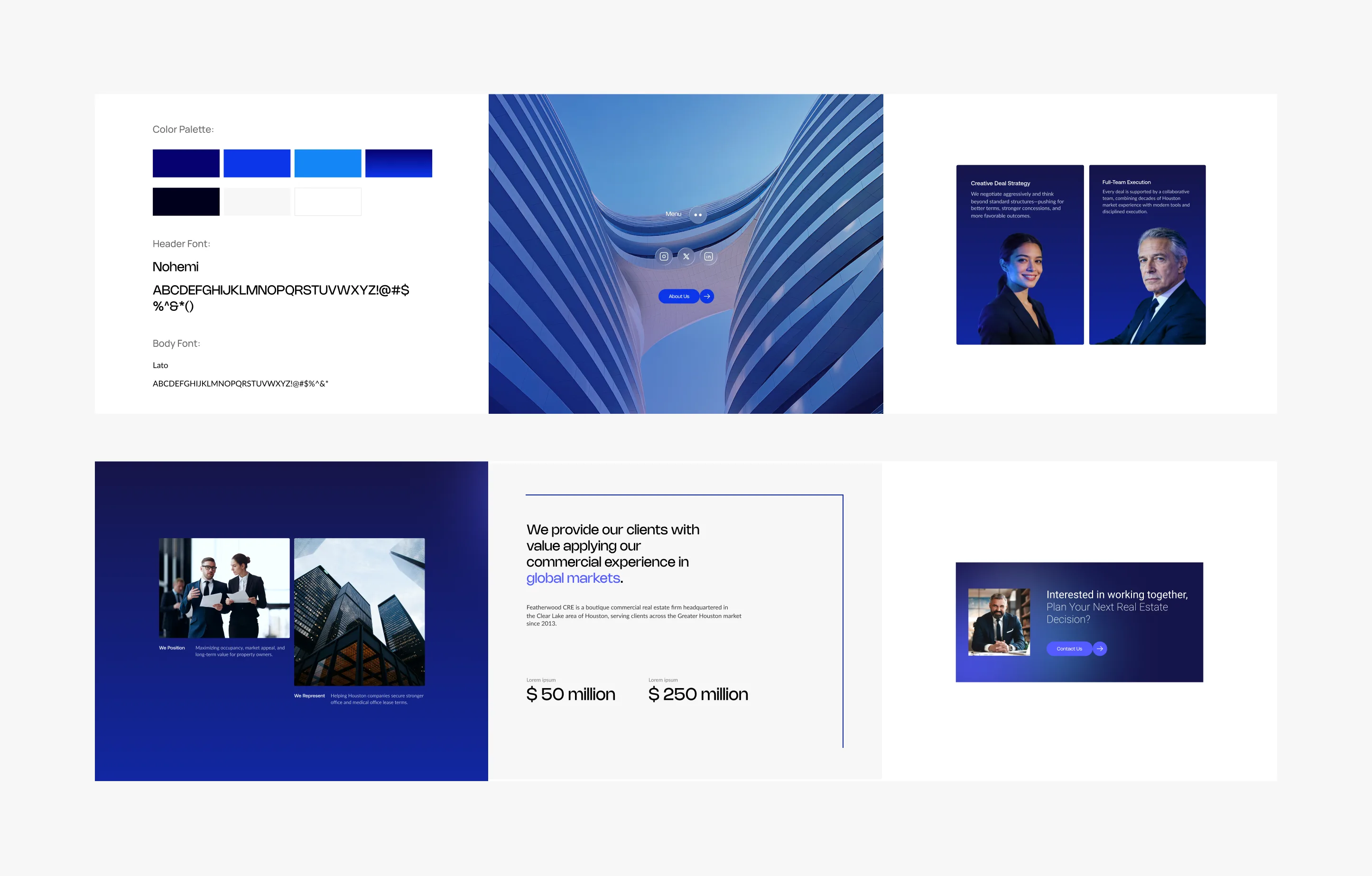
Deep navy gives the experience weight and authority. Cobalt and brighter blues create moments of emphasis, movement, and interaction. Pale tones open the system and allow information to breathe.
Rather than treating the palette as a collection of fixed swatches, we used it as a spectrum.
Color shifts between depth and light, institutional and expressive, quiet and active.
Gradients extend that movement further, particularly across digital environments where transitions, image treatments, interface states, and calls to action can become part of the brand experience.
The result remains recognizably Featherwood, but with considerably more range.
Architecture in Motion
Commercial real estate is usually photographed as an object.
We approached it as an environment.
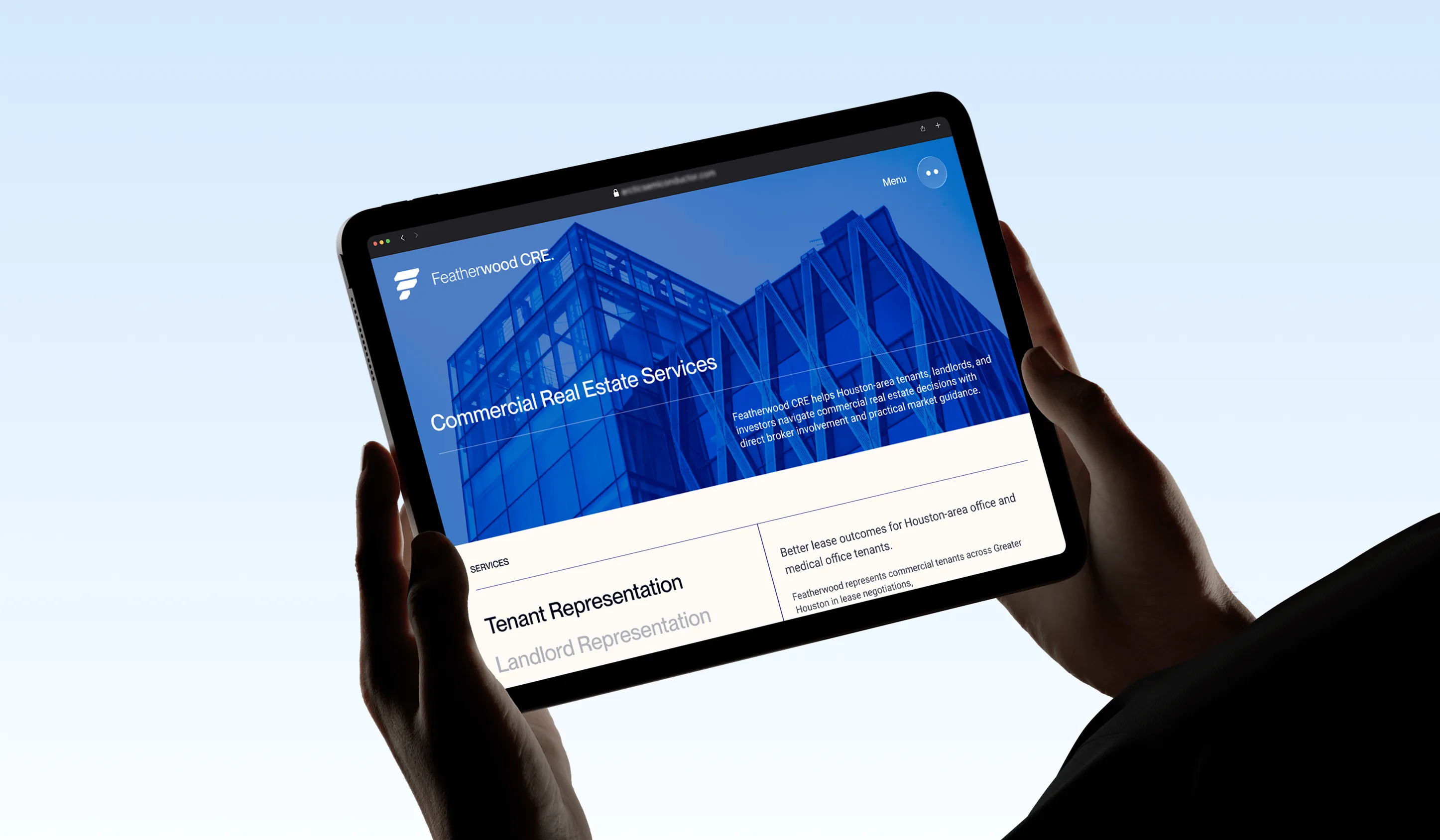
Buildings appear through perspective, repetition, reflection, geometry, and scale. Facades become patterns. Structural lines become movement. Familiar urban forms become more abstract and expressive.
The imagery creates a sense that the viewer is inside the market rather than observing it from a distance.
This change in perspective was important.
Featherwood does not operate from the sidelines. Its brokers work directly with clients, properties, owners, opportunities, and negotiations. The imagery needed to carry the same sense of proximity.
Architecture became more than subject matter.
It became part of the interface.
Information Without Noise
Commercial real estate produces a great deal of information.
The website does not need to show all of it at once.
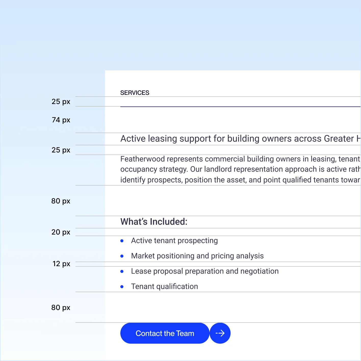
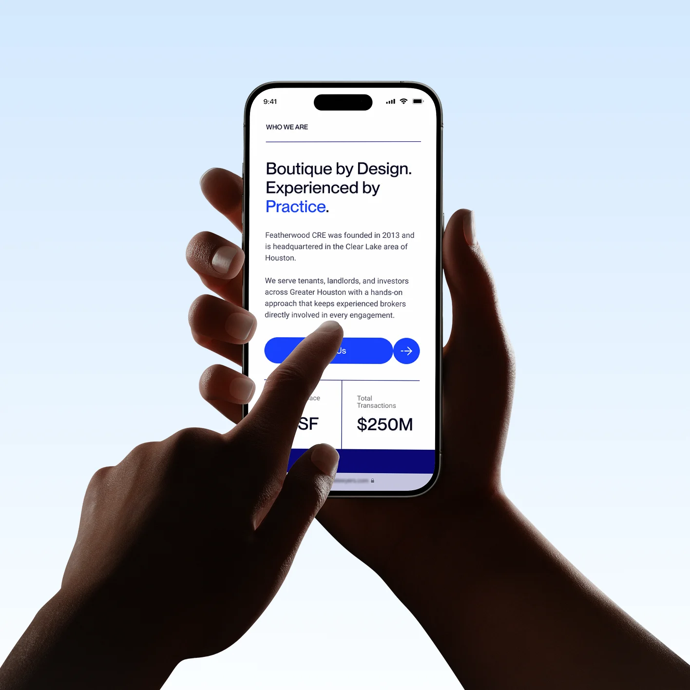
Layouts were designed around strong hierarchy, generous space, concise messaging, and deliberate moments of emphasis.
Large statements establish a point of view.
Statistics are given room to carry meaning.
Supporting information remains quiet until it is needed.
Calls to action are visible without interrupting the experience.
The objective was not minimalism for its own sake.
It was clarity through editing.
The interface allows Featherwood to communicate expertise without performing complexity.
People, Not Just Property
Commercial real estate is often represented through buildings.
Featherwood is built around people.
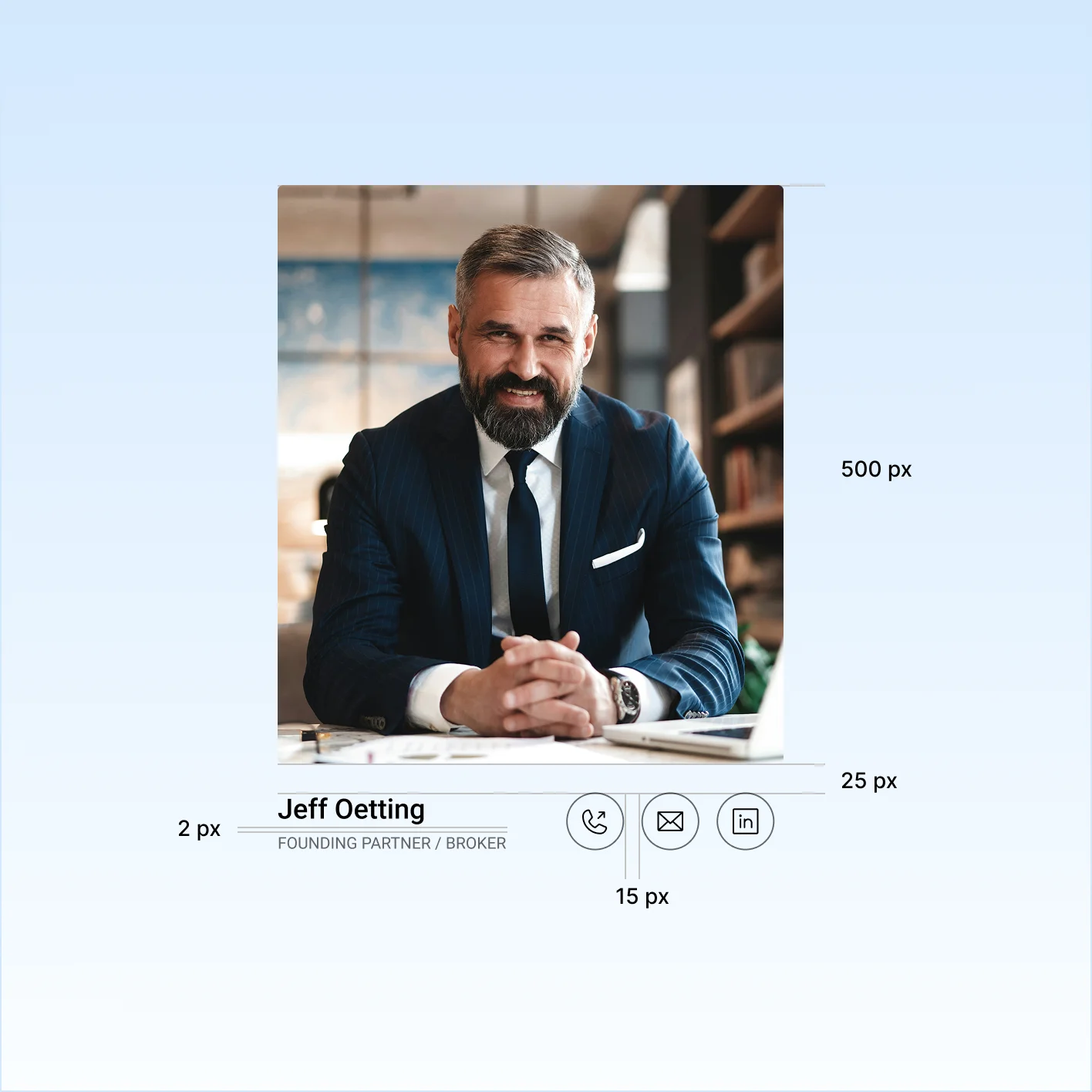
Because clients work directly with experienced brokers, we deliberately gave people a stronger role within the digital experience.
Portraiture sits alongside architecture rather than underneath it.
The effect changes the perception of the firm.
Featherwood is not presented as an anonymous organization with brokers somewhere behind the brand. Expertise is visible. Access feels immediate. The people responsible for the work are brought closer to the client.
For a boutique firm, that distinction matters.
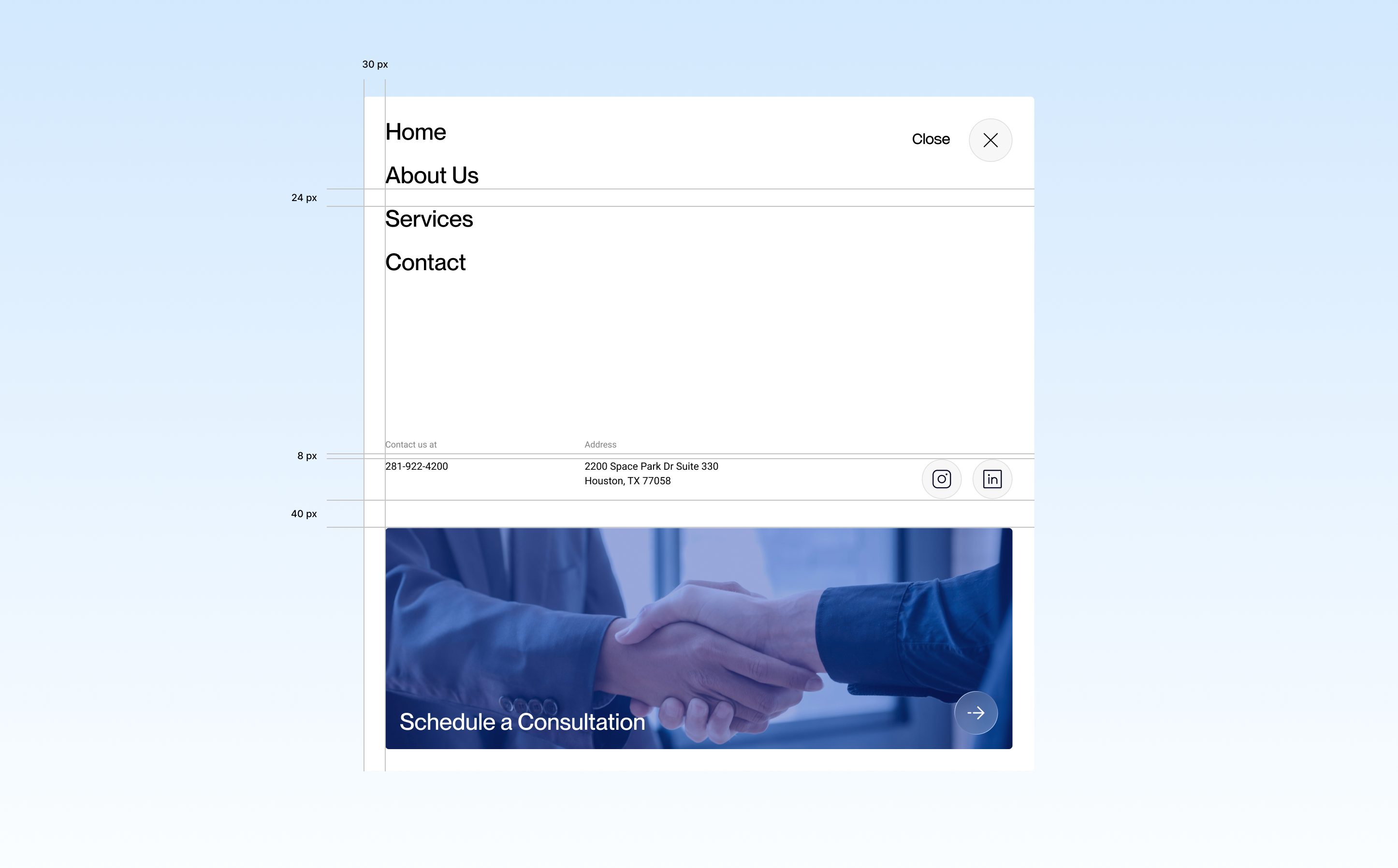
One Firm. Different Sides of The Market.
Featherwood works across the different relationships that shape commercial real estate.
Tenants need representation and leverage.
Landlords need positioning, occupancy, and market intelligence.
Investors need perspective on value, risk, and opportunity.
The website creates a coherent system around these different needs without fragmenting the firm into separate identities.
Each audience can recognize its priorities while remaining inside one Featherwood experience.
This makes the brokerage feel both specialized and complete.
Direct Access, Translated Digitally
One of Featherwood’s defining qualities is remarkably simple:
Clients work closely with the people doing the work.
That idea became an organizing principle for the website.
The experience reduces distance wherever possible. Navigation is direct.
Messaging is concise. Advisors are visible. Calls to action feel conversational rather than procedural.
Instead of making the company appear larger through layers and complexity, the design makes its boutique structure an advantage.
The website communicates access as clearly as it communicates expertise.
Explore More from OWDT
Each project we undertake is a study in precision — where design, technology, and storytelling converge. Discover more of our work and see how we help institutions, brands, and innovators shape digital experiences that endure.
Have Us Contact You

CLOSE PANEL
Thank You.
Your information has been transmitted successfully and securely.
CLOSE PANEL